dawgma

Distinguished
Feb 17, 2007
96
0
18,630
The articles DEFINITELY need more breathing room. They are currently cramped between the left hand menu and the right hand ads area. I hope we will see wider columns used for the articles in the new site along with about a quarter or half inch of extra padding on the sides. The article columns need to be much more dominant compared to the left or right hand content.

I really don't mind that the articles are broken into several pages because it allows for a coherent breakdown in the table of contents. More often than not I won't read an entire article, but instead I will just skip to the parts that interest me.

EDIT: I've changed my mind. It would actually be nice to see at least two or three sections of an entire article on a single page. Just make sure the section titles are easily visible so users can scroll down to the particular section they are interested in.
 

SpeedyVV

Distinguished
May 12, 2007
179
0
18,680
Guys, I really wish you guys the best of luck in your next "version" of Tom's.

One thing I would like to see. A page with the "who is who" @Tom's. Some of the old timers probably know, but it sure would be nice for some of the newer folks.

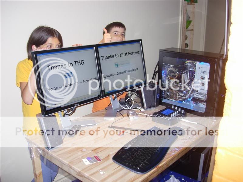
Tom's helped my kids build out 1st DIY computer. You'll always be my #1 site :love:

20070611008Medium.jpg


20070623021Medium.jpg


Tatts

Distinguished
Mar 5, 2008
15
0
18,510
"Nothing is ever perfect out of the shoot, so we do ask..."
That's a CHUTE, out of which nothing is ever perfect. But pedantry aside...

I'm not sure the usability has improved for people reading the articles. This preview was 17 pages long, many of them with only one sentence and a screen shot on the page! That's too much. It just takes too long to read the articles; we shouldn't have to load 17 pages to read one article. If you want to make linkable sections, fine; you could do that with the <a name> function and hop down the page.

And why, in 2008, is the page still so skinny? Aren't most of your readers using widescreen monitors? And even if not, the ones still running 1024x768 could center on the article and scroll left or right to see the menu and ads. Even just making the page 1100px instead of 980px would be a great improvement in readability (while still leaving most of the sidebars visible).
 

picture_perfect

Distinguished
Apr 7, 2003
278
0
18,780
1) This used to be my #1 site for monitor reviews but has been quiet about a year. There's a lotta cool stuff happening!

2) Forum topics should be consolidated like they used to be imo. I'm sure there was a good reason for the current categories but navigation is tedious and probably not poster-freindly (judging by a slow-down in a couple forums). Also is a communication barrier between like-minded posters.

P.S. like second take with ben and rob and spotlight (Tamara is a cutie :))
 

Ombudsman

Distinguished
Mar 11, 2008
46
0
18,530


The page width, which we fight over back and forth, on the design end, is based on the reported resolution of people's browsers.

Multiple pages vs. gigantic vertical scroll is actually left to editorial to decide. The new CMS will do nothing in this regard. Letting the editors who go a little bit overboard with the page breaks will.
 

bumfish

Distinguished
Aug 6, 2006
21
0
18,510
Nooooo! It's going to be like the UK version isn't it? No longer will you be able to see all six headline articles at a glance and you'll have to put up with those horrible javascript replacements for the perfectly functional drop-down box.

I live in the UK but visit the US version of the Tom's site because the UK one - which has been blazing this unfortunate trail for a while now - sucks so much. Now I will have nowhere to go :(
 

Ombudsman

Distinguished
Mar 11, 2008
46
0
18,530


Although the look is similar to the UK site, The design of much of the site navigation resembles a much older design on Tom's hardware. The main objective is to move much more of the content to one or two clicks from the home page.

We will NOT be using the UK style top headlines box. All headlines will be visible at all times.

Full noscript navigation will not be ready day one. I do not consider the navigation complete untill it is though.
 

Luscious

Distinguished
Apr 5, 2006
525
0
18,980

I have to agree here completely with what tatts wrote, I've been browsing on a 1680x1050 screen since 2003 - that's five years guys, half a decade! Absolutely no need to waste all that screen real-estate. The smallest monitor HP offers today with their desktops is a 17" widescreen @ 1440x900. Translation - get with the times. You can argue that not everybody has a 30" display, but we're talking WWW here - are you going to make it dinosaur-compatible or look at what today offers/tomorrow brings???

I disagree with your argument on browser width. A well-designed and smartly-laid-out webpage will fit (and fill) the screen width when I maximize the window, but it will also wrap text properly and condense in width when viewed in window mode - exactly so that if I want two browser windows side-by-side I can read/compare two articles.

I too sometimes find it annoying when pages in articles contain maybe a single paragraph and 1-2 images - doubling the page length would not be such a bad idea.
 

randomizer

Champion
Moderator
I'd really like it if the forums didn't take so horrendously long to load. There isn't even much on here. It's not full of high res downscaled images, yet takes forever to load anyway. Not everyone has 2.5MB/s download speeds as their budget service. Plus do we need to go through so many screens while logging in and posting?

1) *Clicks login*
2) Loads another page: "Checking your identity"
3) Loads yet another page: "You were sucessfully identified".
4) Finally loads the page I was on before.

Why can't we go from 1-4 in one go and skip the two middlemen?

The same with posting. Does it really have to load a page to tell me that I posted? If it reloads the page I posted on, I can see for myself if it posted or not. It may not seem like much, but all those extra 2-3 seconds per page of loading (sometimes more on a bad day) really slow down your ability to surf the site efficiently. If you want to streamline the site then you need to dump the extra pages.

Side note: That budget PC better have a 9600GT in it :kaola:
 

zyberwoof

Distinguished
Apr 6, 2006
135
0
18,680
I really hope the pages width is dynamic and not too optimized for a single resolution.

I'm running a pair of 1680 x 1050 monitors at home and an 800 x 480 Eee PC on the go. Sadly, it feels like nearly every site I go to is too wide for the Eee and has huge empty boarders on my home desktop.
 

tlmck

Distinguished
It would be nice if the charts were updated as well. Anybody at Tom's ever hear of items such as a 9600gt? Vista? Crysis?

Finding out how the ancient Doom3 runs on newer hardware is not exactly exiting. And we are into the 4th month of "2008" you know. I think it is safe to drop the Nvidia 6 series, the ATI x8 series, etc... Folks can always look these up in the old charts.

I used to link people to these charts, but not so much any more due to their obsolescence and irrelevance.
 

randomizer

Champion
Moderator
To retest every card takes forever. Appreciate the time it takes to create those charts. It takes a good hour to hour and a half to do Crysis benchmarks for a number of resolutions in both DX9 and DX10. Multiply that by around 15 different benchmarks, then multiply that by the number of cards and you've got yourself a few weeks worth of benchmarking to do.
 

spellthomas

Distinguished
Apr 15, 2008
1
0
18,510
I would really like to see a single link/tab to view all the reviews performed for the last two weeks or even better month. Tom's use to have it and I am sure I would read more articles if it was back. I agree with way to many pages for an article. I do like the new print function idea.
 

randomizer

Champion
Moderator
What is the huge blank grey space in the bottom right of the main page for? :heink:
EDIT: Oh, ads...

And come on, even the forum section heading is IntelliTxt, this is stupid:

intellitxt.jpg

Sorry for the bad jpeg compression, blame photobucket
 

SpinachEater

Distinguished
Oct 10, 2007
1,769
0
19,810
Huh, my profile header-ma-bob doesn't have the intellitext in it. I am not being change resistant but the front page seems quite packed in. The videos at the bottom left side don’t even have enough room to show a fraction of their titles. The titles are kind of a joke if you are only going to display 9 characters of them.

Suggestion:
Run the video icons like a bullet point list and have the full titles next to the icon like this;

<Video> <title bla bla bla bla bla>

The list will be longer than what you have now but at least the full title of each video would be visible without having to scroll over it.
 

koss64

Distinguished
Dec 27, 2007
221
0
18,680
Return the ammount of forum postings on the front page back to thier original number or greater.I liked that overhead view as to what was going on, now its more of a peephole.
 

aziraphale

Distinguished
May 6, 2004
785
0
18,980
I miss the rolling forum threads...

And COMEON! who uses a b rowser resolution of 800X600? Get along with the times; this is a site for enthusiasts; no one here with a res lower than 1280X1024...And you can pack even more ads in here if you make it a little bigger!
 

MadHacker

Distinguished
May 20, 2006
542
0
18,980
I like the hardware reviews... as they came out...
how many hardware reviews have there been for the new released motherboards...
I use to enjoy reading the several Hardware reviews a day...
now we get one or to a week if we are lucky...
it is suppose to be "Tom's Hardware" not software... if u want game reviews then go to a game review site...
if you want reviews on cars.. go to a car review site...

I use to come here a lot... but now... I find it is mostly pointless...

I don't mind the Advertising they have or the many pages to load up to read all of the review...
If there was a review worth reading...

When was the last time they did a Motherboard review... so many are getting released.. but no reviews...
once a month they release best gaming cards... but there isn't really much else...

So sad...

Perhaps they should change the website name from TomsHardware.com to mostlynonhardware.com

edit: typos
 

hfxmike

Distinguished
Nov 21, 2007
16
2
18,515
The VGA charts SUCK.

I haven't looked at a lot of the other new changes because I'm upgrading my video card.

It WAS so easy to compare my old x850 to another card. Now it is a massive pain - bring back the old charts with the option to compare two cards. At the very least, bring back your interactive chart archive!!