Review Silicon Power XD80 SSD Review: Mainstream Performance at Low Cost

On these disk reviews, why is it that the line graphs for the iometer sustained sequential write, gigabytes written don't use properly spaced values along the X-axis? By this I mean the intervals are labeled "0, 0.5, 1, 2, 5,10, 15 (minutes)" yet spaced in such a way to indicate that the amount of time between 1 and 2 minutes and the amount of time between 2 and 5 minutes is the same (which it isn't). Last time I did math the median value of the numbers 0 through 15 wasn't 2, nor does the median value of 0-2 minutes work out to 45 second.

When graphed with equally spaced X values (based on the values at 1, 2, 5, 10 and 15 minutes as provided on the bar graph for this test), most of the drives write at a linear rate within 2 minutes of starting the test (because the SLC cache has run out by then). However, when I look at the 15 minute graph, it looks like the drives start the test slowly, then around the halfway point they all (metaphorically) rail a line of blow and the amount of data written skyrockets (not how drives out of SLC cache work). The graph for 2 minutes isn't all that much better.

I've added the links to the 2 problematic graph images here for convenience:
Graph Linky and another Graph Linky.
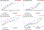
I mainly used the gigabytes written data for the bar graph and throw that same data in for line graph to have another way to look at the data. The second is just a crop/zoomed-in view of the same to see the differences in cache a little easier since these are small charts. I went ahead and did some adjustments for you based on your feedback. Personally, I prefer looking at the data how I've been publishing it since it enhances the tail whip effect and SLC cache size differences, which I can more quickly differentiate, but can start throwing in this new graph instead if you prefer it.
Do you prefer the charts on the left? I appreciate the feedback. If you have any more, let me know. Thanks.

92
 
  • Like
Reactions: Howardohyea
I mainly used the gigabytes written data for the bar graph and throw that same data in for line graph to have another way to look at the data. The second is just a crop/zoomed-in view of the same to see the differences in cache a little easier since these are small charts. I went ahead and did some adjustments for you based on your feedback. Personally, I prefer looking at the data how I've been publishing it since it enhances the tail whip effect and SLC cache size differences, which I can more quickly differentiate, but can start throwing in this new graph instead if you prefer it.
Do you prefer the charts on the left? I appreciate the feedback. If you have any more, let me know. Thanks.

View attachment 92


I 'd vote for charts on the left. It's a better presentation of the information.
 
  • Like
Reactions: seanwebster
Wow, this is a true steal, and absolutely all you need for PC gaming.

If I didn’t use my machine for IO intensive stuff I’d buy two of these puppies, and even then I’m considering them anyways.

power-wise I’d need to test it a bit more on Linux to see if laptops would do well with it, but holy moly.
 
Does anyone have the idle power usage of these or can someone explain why the samsung 970 evo and intel 660p are so low?
The review says just under half a watt. That seems abnormally high. It doesn't make sense given the temps and efficiencies compared to the samsung.
In contrast the (samsung 970 evo pro) uses 30 - 72mW with ASPM on or off according to the review here Samsung 970 evo Plus.
For lower power consumption figures ASPM needs to be enabled in the UEFI. Not all systems support toggling this in the UEFI. Therefore, we test power consumption with ASPM disabled on our latest test benches.

Additionally, the lowest desktop idle idle state data, while important, isn’t as important as laptop idle state data. That, however takes more effort to attain and is something outside the scope of a normal review.