Review Lexar NM790 SSD Review: A Pleasant Surprise

A few requests for chart usability:
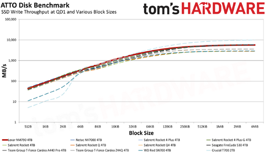
-Plot the ATTO charts on a log-lin scale. The crucial portions are the low-QD areas, and those are just an unreadably thick overlaid line.
- Along with the data-rate/time IOMeter plots, add data-rate/data-transferred plots. This allows drives to be compared in terms of buffer size, and most workloads scale by filesize rather than by data-independant-duration.
 
  • Like
Reactions: vehekos
A few requests for chart usability:
-Plot the ATTO charts on a log-lin scale. The crucial portions are the low-QD areas, and those are just an unreadably thick overlaid line.
- Along with the data-rate/time IOMeter plots, add data-rate/data-transferred plots. This allows drives to be compared in terms of buffer size, and most workloads scale by filesize rather than by data-independant-duration.
So, to the first point about ATTO, please note that these are not low queue depth results. They're block size transfer rates. The drives are tested using the default QD of 4 — not necessarily fully realistic, but at least better than QD32 stuff. :) Anyway, ATTO is very much synthetic and I wouldn't depend too much on its results as a true indicator of performance. What it really shows is how performance scales with larger block sizes and reads/writes. I think a lot of SSDs are tuned for maybe 256KB blocks, or at least they'll do way better at 256KB than at 4KB.

The other issue is that if we switch to logarithmic, it just trades "viewability" of the low block sizes for "unreadability" of the larger block sizes. Like this:

1696004627258.png

Most SSDs still clump together at small sizes, while larger sizes don't look particularly different. Most people are less familiar with log scaling, and I'd very much worry that anyone looking at the above chart would think, "Oh, there's almost no difference between any of the drives past the 4KiB mark!" We could also provide both standard and log scaling versions of the charts, though, so I'll see what Shane thinks.

Your second question, I'm not sure what you're trying to get at. We show how the drives handle sustained 1MiB writes for 15 minutes, as well as a "zoomed in" 150 seconds view. Then we have a chart that shows the steady state performance at the end of the 15 minutes. It's not meant to be a real-world workload, but just a worst-case sustained writes workload. We note how big it indicates the pSLC cache is on the drive being reviewed, though of course that's for an empty drive.

But I will say that in my experience, drives that have higher steady state numbers don't tend to feel slower over time, particularly as they get filled up. It's one of the reasons I really dislike QLC drives. I have yet to use one in any long-term scenario where I end up thinking, "This is fine." Take a 2TB QLC, put 1.5TB of data on it, and on a lot of drives they'll start feeling more like a moderately fast HDD than an SSD!
 
  • Like
Reactions: TCA_ChinChin
So, to the first point about ATTO, please note that these are not low queue depth results. They're block size transfer rates.
Yep, that was a brainfart, tried to write both points up at once, split them apart, and copied the wrong value.
The log chart does show where some drives diverge in the low transaction size area that most strongly determine perceived responsiveness (e.g. immediate UI interactions) and show an order-of-magnitude difference in performance where the linear chart squashes that to nothing to highlight a ~4x difference in performance.
Your second question, I'm not sure what you're trying to get at. We show how the drives handle sustained 1MiB writes for 15 minutes, as well as a "zoomed in" 150 seconds view. Then we have a chart that shows the steady state performance at the end of the 15 minutes. It's not meant to be a real-world workload, but just a worst-case sustained writes workload. We note how big it indicates the pSLC cache is on the drive being reviewed, though of course that's for an empty drive.
Charting with the data transferred across X rather than time gives an instant visualisation of how much data can be moved in one lump before the drive drops to steady-state performance (e.g. "I move 50GB BD images around, Drive X is slightly faster at peak for 30GB then drops, but Drive Y is a bit slower at peak but will sustain that for 60GB, so is better for my use-case even with a lower peak performance number"). Wall-time before saturation does not give you any meaningful information, because workload duration depends on data-rate and data-size, and you have then only charted one of those rather than both (i.e. you are charting an X axis where the X value is dependant on the Y value rather than independent ).
It would also drive home to people that do not regularly transfer large files that they will be experiencing the peak performance almost all the time rather than the saturated performance.
 
I'm assuming that Lexar is normally good. I recently had a Lexar 2TB burn itself up on me. I even tried mounting a heatsink on it but it still died. It lasted for less than a year (thanking my lucky stars that I back everything up).
which lexar did you have and how much temp c thank you :)
 
  • Like
Reactions: Avro Arrow
which lexar did you have and how much temp c thank you :)
The part number was LNM610P002T-RNNNG. I don't recall what the peak temperature was but the thing clearly had something wrong with it because it was idling at 62°C. I seem to remember the temperature going into the mid 70s but I'm not 100% certain. It was CrystalDiskInfo that first alerted me to the problem.

Now, I don't blame Lexar for this because anything made by human hands will have "X" number of bad units per thousand. I've used Lexar products before and they've worked perfectly. I think that perhaps the entire batch of LNM610P002T-RNNNG drives had problems because they didn't have any to replace mine. Instead I sent them my Canada Computers invoice and they refunded me the invoice total. I'd call that pretty good customer service so I commend them on that.

At the end of the day, ALL forms of memory are made by Samsung, Hynix or Micron regardless of what brand is stamped on the product. The first time that I bought Silicon Power RAM, I had never heard of them before but, since I knew that it had to be made by one of the above 3 companies, I honesty didn't care what brand it was.

Canada Computers had some nice sale on the Team MP33 2TB PCIe3 NVMe drive (I think it was like $90CAD) and so I just bought two of those to replace the LNM610P002T-RNNNG. It felt pretty good to double my gaming drive space from 2 to 4TB. 😉
 
Just reading this review and I'm a little confused by the sustained write performance and the subsequent average steady state MB/s results:

In the sustained write graph over 900 seconds the Teamgroup A440 seems to be one of the best performing drives, writing at 7000MB/s for around 60 seconds, then 4000MB/s until near the end of the test (maybe 860 seconds, or just over 14 minutes, when it drops to 1700-1800MB/s.
cPd9dv25SmnDxy6jUirjVf-1200-80.png.webp


But then in the following chart, the same drive is shown with a "Average Steady State after 15 minutes" of just 1550MB/s:

St6hvPJqVgLnj93bUw7hbf-1200-80.png.webp


And, in fact, if we do the maths from the slightly different charts on the A440 Pro Review:

iSLH6ok2S2mbSwjrseBDej-1200-80.png.webp


3574GB written over 15 mins/900secs = 3941MB/s average.

The only thing I can think is that you aren't taking the average over the entire period, but an average of the last few seconds - but even in this case it doesn't seem to line up with the graph, which seems to show over 1550MB/s even in the very last part of the write. However, if this is the case, I would be interested to know why this is considered a useful enough metric to be one of the included graphs in the review.
The bar chart shows steady state performance for 40 seconds, after folding has taken place. So larger 4TB drives will take a lot longer to first get through the charge, then through the direct to TLC/QLC, then through folding.

As an example, after the 60 seconds or whatever of cached writes, it can take 20 minutes or more to get through the direct to TLC section. 900 seconds is only 15 minutes and so the slower folding state may not show up in the line charts. And some drives like the T500 take a long time in the folding state, like 20+ minutes again. But that’s with an initially empty drive. If you have a 4TB with 2.5TB of data on it, you’ll go into the folding state a lot faster.
 
  • Like
Reactions: mega maniac