- Nov 21, 2018
- 26,767
- 1,239
- 44,560


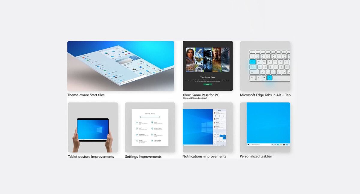
Windows 10 October 2020 Up is starting today, but Microsoft is throttling the rollout for a better experience.
Microsoft Rolling Out Windows 10 October 2020 Up With UI Changes, Throttled Availability : Read more
Microsoft Rolling Out Windows 10 October 2020 Up With UI Changes, Throttled Availability : Read more


") I've always been using CTRL + Page Up (equivalent to CTRL + TAB, apparently) and CTRL + Page Down ...
I've always been using CTRL + Page Up (equivalent to CTRL + TAB, apparently) and CTRL + Page Down ... Twitter