New Tom’s Forum Announcement & Feedback

Status
Not open for further replies.

jpishgar

Splendid
Overlord Emeritus
The Tom’s forums have migrated to a new, more powerful forum platform. We’ve rolled out a substantial upgrade to the forum by moving to XenForo forum software.

The new forum features:
• An exciting new reputation system - earn epic trophies!
• Trending, new, and popular threads to engage in.
• Much improved stability
• Improved user interface and search functionality
• ...and tons of new features

As this is a very big change, and we realize it can take a little time to get used to a new forum environment, we’ve put together a useful User Guide to the New Tom’s Forum that will help you adjust to the new changes.

Here’s answers to the big questions that you need to know:

Q. How long will the forums be down for the upgrade?
A. It’s a super-big upgrade, so the forums might be down for a while. We ask for your patience and to please bear with us during the upgrade. There may also be some stability issues immediately after launch, but we’ll work to fix these post-haste!

Q. What happens to all my posts and stuff?
A. Everything is being migrated over to the new platform, so your posts, user credentials, and everything should remain the same for you. You’ll be able to login as usual and get back to normal life in the forums. The biggest change you’ll experience is the interface itself, and a few of the awesome new systems. Also of note is that Tom’s Hardware and Tom’s Guide are now fully separate forums, and no longer have shared categories.

Q. How do I…?
A. Almost all of the questions you’ll have about where stuff went and how to interact with the new systems can be found in the User Guide to the New Tom’s Forum [adjust URL per site].

Q. Why is this change being made?
A. The new forum software is significantly more powerful, and puts the Tom’s Community in a position to grow. It provides much greater flexibility in themes, features, category management, and more. Plus, it’s a much nicer experience for our members overall.

Q. What about article commentary?
A. Directly commenting on news and feature articles will be unavailable for what we expect will be a couple of months after the upgrade while work proceeds on bridging the editorial and community systems. In the interim, you will find commentary on the latest news from Tom’s in the forums under the “Article Commentary” category.

Q. It looks like I'm logged in as a different user!
A. Fortunately, you aren't! Though you may feel like a (temporary) imposter, rest assured, the only thing that might be incorrectly displaying for you is the user name in the upper right-hand corner. This is due to a rare caching issue for previous users. To fix it, simply log out, and log back in.

Q. What happened to my Best Answer count / Badges?
A. All Best Answer counts were migrated. Your credit for badges or the count may be different than you remember, because the previous system awarded badges (now called trophies) based on tags per thread solved, rather than per given category in which the thread was solved. As a result, members could answer one question and get credit towards 5-10 badges. The new method now awards Best Answer credit on a 1:1 basis, per category, and the reputation system has been widely expanded.

Feedback & Issues

If you bump into any problems, have feedback, or encounter any issues with anything in the upgrade, please let us know with a response below. The Community Team and developers will be monitoring this thread before, during, and after the upgrade, and it is our aim to make this transition as smooth as possible for our awesome members.

If you absolutely cannot login to post a response to this thread about an issue you are experiencing after the upgrade, first try the password recovery option, and secondly, email us at community@tomshardware.com with a detailed description of the problem.

Yours,
~The Tom’s Community Team
 
Last edited:

clutchc

Titan
Ambassador
Definitely a bright and colorful forum website. Hope the slowness is just the startup bugs being worked out, tho. If there are fewer glitched than with the old forum software, it will be worth it.

Now for an old dog to learn new tricks... ;)
 
  • Like
Reactions: Rogue Leader

jpishgar

Splendid
Overlord Emeritus
Hope the slowness is just the startup bugs being worked out.

Performance might be a tad slow for a bit as caches get up to speed, and the system stabilizes. Do bear with in the interim, and you should find the new forums a much-speedier experience than the prior. :)

-JP
 
Hi all,

Like the new forum! Thank god it arrived after 3 weeks out :) Speed is slow, but that will pick up over the coming days no doubt. Some minor glitches. Mainly with last 5-10 threads where I've had best answer chosen, they don't seem to have taken to the new system. So instead of being over 700 best answers, I'm back down to 684.

Other than that, I like it. More options, easy to navigate and the design is a little more modern and fresh. Of course will take some more getting used to, but good job so far.
 
Thank you for the update, it was sorely needed and appreciated :)

I have noticed a bug already, that font size BBcode seems to be currently non-functional, not just on older posts but on newer posts as well.
Demonstration here:
View: https://www.youtube.com/watch?v=iyDoEe2FpN0
EDIT: As you can also see, the "colon + slash" characters automatically get converted to an emoticon, which looks like it will affect every single URL that begins with "http", might want to look into doing something about that too :p

Secondly, some out-of-order posts. The guide I wrote is separated into several back-to-back posts. However, with the update, one of the newer posts in the thread has somehow been moved up further in the thread, between some of the posts in the guide. Here is an image (note the dates of the posts)


In addition, a feature request. It would be highly appreciated if you would implement a formatting option for paragraph spacing/indents. Having this capability is very important for making long guides or posts more readable.

Previously, I could accomplish this with a workaround where I would create a {list}{/list} item and simply write text without adding any bullet point items {✱} {/✱}; this would have the effect of indenting the paragraph. However, this no longer works since with the new software, the beginning of a {list} item has a bullet point added automatically even if I don't put any {✱} in. Now, as you can see, my guide has a bullet point at the beginning of every indented section.

Since that no longer works, it would be nice if a dedicated BBcode option for paragraph indenting could be added. Like I said, it helps make long guides more readable, like this). It shouldn't be complex to implement, it's as simple as making a BBcode that creates a div box with leftpadding=32px.

EDIT: As you may have noted above, I also had to use the "heavy asterisk" unicode character to type an asterisk; it seems that normal asterisks are removed and treated as italic tags (for single asterisk) or boldface tags (for double asterisks). I find this behavior annoying and would prefer it to be removed. I know asterisks are used for formatting in places like youtube comments or reddit, where there are no formatting buttons (until recently, in Reddit's case), but given that this forum has formatting buttons, and CTRL shortcuts also work, there are plenty of ways to format text as italic or boldface already, this asterisk behavior is redundant and just prevents people from typing actual asterisks. If you want to keep it, at least provide a method for escaping characters so we can type a literal asterisk if we want to instead of them disappearing and converting into formatting tags. I tried backslash+asterisk but that didn't work. But I would prefer that the asterisk formatting behavior just be removed entirely.
 
Last edited:

jpishgar

Splendid
Overlord Emeritus
Thanks for the heads-up on the bbcode/formatting issues. Most of the forum bbcode was ported over, but there's definitely going to be some legacy formatting issues, as a lot that the previous platform was doing was very proprietary with formatting styles. The new forum has much improved BBcode and formatting options. We'll look into seeing what can be done for formatting on our end to parse older code, but for expediency's sake, it may be worthwhile to reformat the guide you produced.

As for the forum post order itself being wonky, that could be an issue. We'll investigate.
 
We'll look into seeing what can be done for formatting on our end to parse older code, but for expediency's sake, it may be worthwhile to reformat the guide you produced.
Thanks for the response. I'm working on reformatting now, and I was expecting that some of the bbcode would have to be changed since the new forum might operate differently, I don't mind that. I was just mentioning things that I don't have any way of addressing, such as the font size, which seems to be non-functional. Even if I try to change the font-size using the formatting buttons in a new post (like this one), it works all fine in the WYSIWYG editor, but as soon as the post is submitted, it just shows up as BBcode tags rather than actually changing the font size.

Like so :)

And as mentioned, I don't currently have an alternative method for paragraph indentation, so it would be nice if that were added to the forum :)
(EDIT: Turns out there is paragraph indentation after all! I just didn't see it :3 Hooray!)

Anyway, thanks again, glitches aside, this seems to be a great improvement over the older forum.
 
Last edited:
  • Like
Reactions: Rogue Leader
Jan 20, 2019
1
0
10
Liking the new format. Are there any plans to have a feed on the main page like the old forums. Used to go there daily to read questions and build my PC knowledge base. Hope so.
 
Not really pleased seeing all the hard work I put in as far as the old badges were concerned, only to find that all of that seems to be gone. While I see many things I should have attached to others, I'm a bit puzzled and left wondering if the migration is still in progress or not and whether I'll get all those things back?

Any mods want to chime in here?
 
I was hoping for a better experience, and all the staff raved about XenForo, but this is not looking much better so far to me.

This will be relatively short as I've only just logged in a few minutes ago.

Pros

1. I can FINALLY see advanced editing options (including video embedding) while using a VPN and Chrome Incognito Mode. Before I had to submit my reply, then go back in to edit it to embed a video.

2. It has the ability to comment on Articles (formerly Tutorials).

Cons

1. It takes way longer just to login or go to the main forums headings page.

2. It's WAY harder to see unanswered threads than before.

3. There's not NEARLY as many threads showing per page.

4. It's not at all efficient on using lateral space. The thread width is either way too narrow, or a little bit wider with too large fonts.

5. The text is very faint.

6. Looks VERY plain.

Of course it will take a while to get an overall impression, but it's not exactly making a good first impression, let alone great like some are saying. The biggest shocker is probably how bland it looks.
 
Last edited:
I was hoping for a better experience, and all the staff raved about XenForo, but this is not looking better at all so far to me.

This will be relatively short as I've only just logged in a few minutes ago.

1. It takes way longer just to login or go to the main forums headings page.

2. It's WAY harder to see unanswered threads than before.

3. There's not NEARLY as many threads showing per page.

4. It's not at all efficient on using lateral space. The thread space is either way too narrow, or a little bit wider with too large fonts.

5. The text is very faint.

Of course it will take a while to get an overall impression, but it's not exactly making a good first impression, let alone great like some are saying.
The speed is a result of the millions of threads being migrated and indexed.
During testing, it was substantially snappier than the old software.
The text can be fixed with additional themes to be added soon. Or consider the dark reader extension (Idea by blackbird)
 
  • Like
Reactions: Barty1884
Not really pleased seeing all the hard work I put in as far as the old badges were concerned, only to find that all of that seems to be gone. While I see many things I should have attached to others, I'm a bit puzzled and left wondering if the migration is still in progress or not and whether I'll get all those things back?

Any mods want to chime in here?
You should have far more trophy points than 0, as well as several badges already.
Give it some time, but if its not fixed in the coming days let us know again.
 

Barty1884

Retired Moderator
Not really pleased seeing all the hard work I put in as far as the old badges were concerned, only to find that all of that seems to be gone. While I see many things I should have attached to others, I'm a bit puzzled and left wondering if the migration is still in progress or not and whether I'll get all those things back?

Any mods want to chime in here?

To speak to this, your data will still be in the migration stage. It's certainly not gone, nor should it take much beyond ~24hours or so for the main migration to take place.
As you'll see, Mods have their scores/trophies etc showing - as we were migrated early to test (although I'm sure some of it still needs to be caught up).

You won't directly get all BA's "back" necessarily, simply because there is not a 1:1 mapping in all instances.
However, this affects all members of the forum and you'll see a proportionate reduction throughout.
 
  • Like
Reactions: Gam3r01
The speed is a result of the millions of threads being migrated and indexed.
During testing, it was substantially snappier than the old software.
The text can be fixed with additional themes to be added soon. Or consider the dark reader extension (Idea by blackbird)
Thanks, I guess I was thinking the first time it was usable they'd have been farther along with the change over. Looking forward to new theme options and faster operation.

Not a big fan of adding such extensions though as I have Clear Type set to max boldness of fonts. So an extension like that would make this site look acceptable, but others too bold. Even if it allows you to select which sites it's enabled on, I just like to avoid extensions if I can to keep my browser fast.

BTW, ditto on the zero trophies, and that page looks surprisingly WAY more bland than the previous forum as well.
 
Thanks, I guess I was thinking the first time it was usable they'd have been farther along with the change over. Looking forward to new theme options and faster operation.

Not a big fan of adding such extensions though as I have Clear Type set to max boldness of fonts. So an extension like that would make this site look acceptable, but others too bold. Plus I just like to avoid extensions if I can to keep my browser fast.

BTW, ditto on the zero trophies, and that page looks surprisingly WAY more bland than the previous forum as well.
The issue was there was no way to transition the data without the userbase outside of a select few for testing, so its a trial by fire per-say.
 
  • Like
Reactions: Barty1884
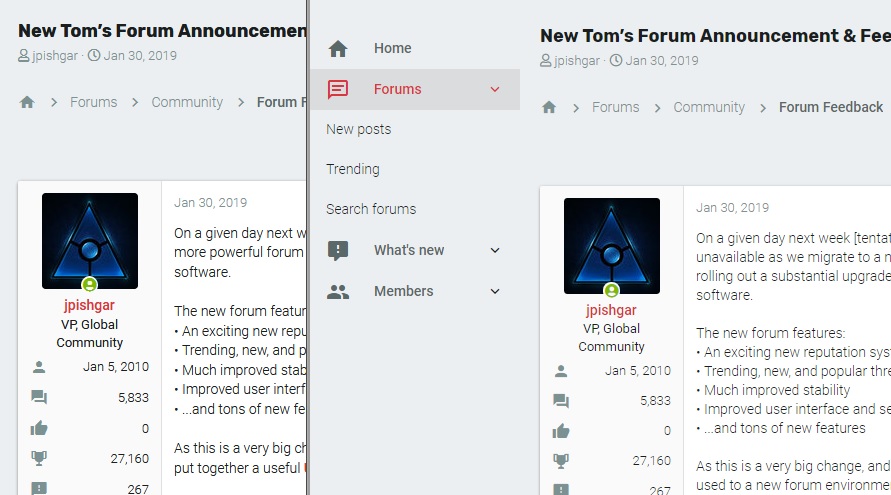
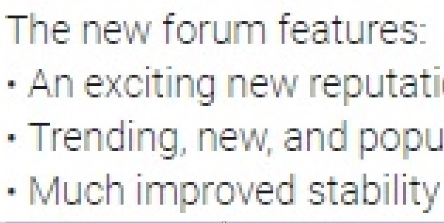
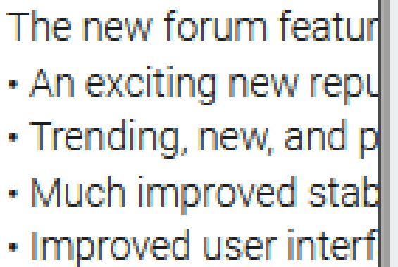
On Chrome, the default font is extremely light, sort of a medium grey instead of black. I did a screen capture and zoomed in, and the problem is the lines of the font are way too thin. The font anti-aliasing ends up creating a lot of grey pixels and few black pixels. Those on 4k displays may have less of an issue, but at 1080p I have to squint at the screen to read it. If I enlarge text in the browser to 200%, the font darkens a bit, but the lines are still way too skinny. Bold text shows up fine (if a bit too fat).

Firefox seems to render the fonts better. Here is the same page, Firefox on the left, Chrome on the right.

toms1.jpg


Here is the Chrome version zoomed in

toms2.jpg


Here is the Firefox version zoomed in. You can see how it's much darker.

toms3.jpg


I tried changing the font size in the my account preferences, but it seems to have no effect. The fonts stayed the same size (a bug? or is that setting for changing font size elsewhere?). And I can't find an option to change the font to something else.

Edit: Another possible bug. It retains a copy of the above reply in the Post Reply window, after I'd posted it. It's gonna be really easy to accidentally double-post when you're just trying to edit a reply, or reply to a different thread.
 
Last edited:
Thanks for the follow up, guys. I now see many of the items that were missing. I didn't expect a straight 1:1 changeover ad some things might become redundant or no longer applicable. I should have simply been more patient given all that is going on in the background.

As a request, could it be set up to have... a dark mode?
Good to see your points got updates.
A dark theme is indeed one of the themes to be added.
 
I was hoping for a better experience, and all the staff raved about XenForo, but this is not looking much better so far to me.

This will be relatively short as I've only just logged in a few minutes ago.

Pros

1. I can FINALLY see advanced editing options (including video embedding) while using a VPN and Chrome Incognito Mode. Before I had to submit my reply, then go back in to edit it to embed a video.

2. It has the ability to comment on Articles (formerly Tutorials).

Cons

1. It takes way longer just to login or go to the main forums headings page.

2. It's WAY harder to see unanswered threads than before.

3. There's not NEARLY as many threads showing per page.

4. It's not at all efficient on using lateral space. The thread width is either way too narrow, or a little bit wider with too large fonts.

5. The text is very faint.

6. Looks VERY plain.

Of course it will take a while to get an overall impression, but it's not exactly making a good first impression, let alone great like some are saying. The biggest shocker is probably how bland it looks.
I don't know about the pros you listed, but I couldn't agree more with all the cons you listed - YUCK!
 

Karadjgne

Titan
Ambassador
As to the fonts thing, does changing styles do anything? On Android, the tom's, uni-x and uni-x/material styles all have this uber fine letter font. Using default Xeno style, the font is considerably thicker and much easier to read. But then again, I'm looking at a WQHD+ 2960x1440 display.
 
The issue was there was no way to transition the data without the userbase outside of a select few for testing, so its a trial by fire per-say.
Any word on whether we might see a # of threads per page option, so that we can see same or at least close to the # of threads per page the old forum had? I'd also like a way to make unanswered threads easier to distinguish quickly like before.
 

Barty1884

Retired Moderator
The amount of ads on mobile version make the site unusable. Really disappointed! Some pages are over 50% ads. Never had this problem before.

As far as I know, ads should not show once you have 5(?) best answers selected. Not a perfect answer, and if it's not usable on mobile full stop, that's definitely noteworthy.

Any word on whether we might see a # of threads per page option, so that we can see same or at least close to the # of threads per page the old forum had? I'd also like a way to make unanswered threads easier to distinguish quickly like before.

Not 100% sure on modifying # per page, we'll have to see. As for 'unanswered', do you mean threads with no responses? Or threads that do not yet have a solution?
If the former, on the left you should see "unanswered threads". That's actually easier to distinguish as a whole (opposed to filtering the unanswered).

I asked before the switch if links to the forum threads for articles would be included in the article but I don't see them, can we still expect that?

Yes, they're in the works - but I recall they won't be immediately available, they'll follow in time.
 
Status
Not open for further replies.